Project Summary
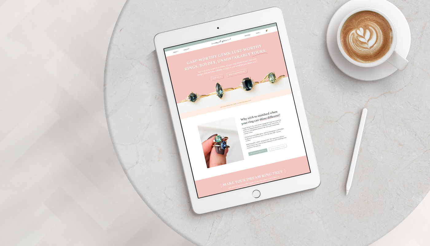
Teagan, the owner of Oval + Pear (and a certified gemologist – how cool is that?) came to me for a redesign of their current e-commerce website. The current site didn’t reflect their new branding or the products they offer (gorgeous custom and bespoke engagement rings). Their website also wasn’t easy to navigate or use, and didn’t clearly explain or display their range.
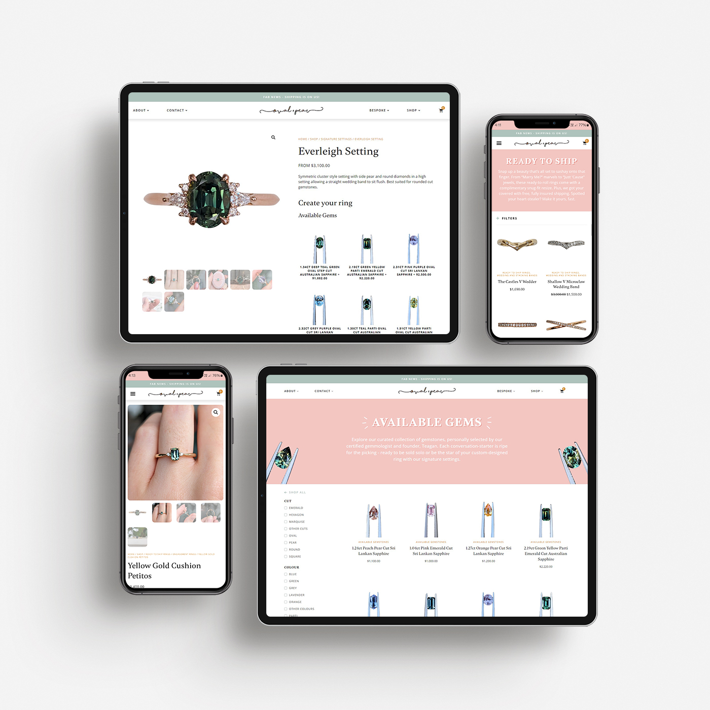
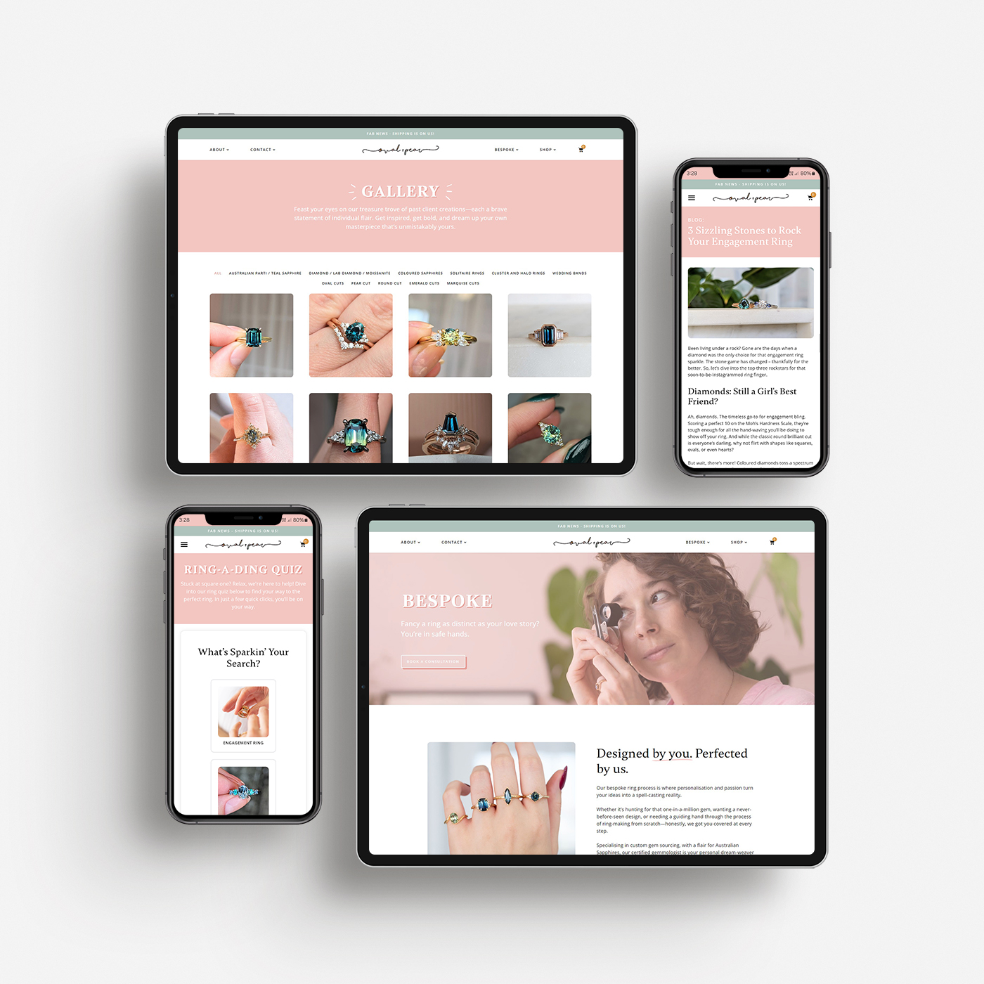
This meant that user experience was a big focus of the re-design (along with the visual aesthetics) and the main challenge was working out how to display and categorise the range and options (ready to ship rings, available gemstones which can be purchased individually or created into a ring, customisable ring options, fully bespoke/custom designed range). We divided these into clear categories which were easier for the customer to understand and made sure they were explained throughout the site. Additionally, we enriched product pages with detailed information and intuitive call-to-actions (CTAs) to guide users through the available options. We also created an interactive product quiz to help guide website users through the range, and direct them to the product or page which would be most suited for them.
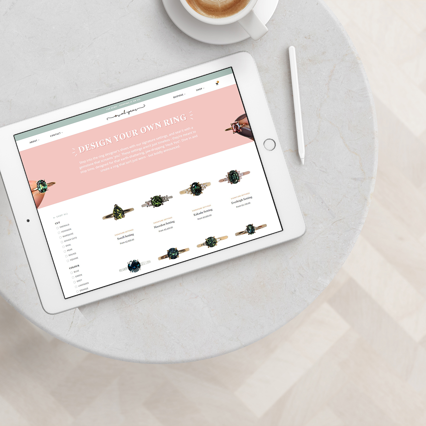
A new product type was also created for a Design Your Own Ring customisable bundle product, which allows users to start by selecting a desired setting and then customise with a gem, band, ring size and other relevant options. As the single gems are also available for single purchase or to create in settings, the individual gem products then also display the relevant settings they can be created in on the individual gem product page (again – to make life easier for the website user).
The previous website shop page was also difficult to navigate, requiring users to first click “shop all” and then with the various categories just at the top (requiring another click through) and all products underneath. So, the new shop page was also given a major overhaul, eliminating unnecessary clicks by presenting all products upfront and incorporating handy filters for effortless searching based on gem colour, product range, and more.
Along with the enhanced user experience, the website design was also obviously a major important part of this project, to ensure that the site accurately conveys the Oval + Pear brand and the high value items/experience that they offer. We ensured the website reflected the essence of Oval + Pear’s brand – playful yet professional.
Finally, a filterable gallery was also created to show some of their amazing work and so users can quickly see some of their past work.
As with all of our redesigns, we rebuilt this site from scratch rather than redesigning over the old site. This means the site and images can be fully optimised during the rebuild, to also ensure that the new site doesn’t carry over any security or performance issues from the old site, and it loads quickly for users (another important part of UX!). This also allowed the old site to still be up and running during the redesign phase, with previous customer and order information then easily transferred over at launch.
It was truly a pleasure to create a website that does justice to the exceptional craftsmanship and beauty of Oval + Pear’s creations.
We have just completed a full website overhaul with Sophie at Kitsune. Sophie is an impeccable project manager and has amazing attention to detail.
She was solutions focused and extremely patient with us while we made multiple changes and went back and forth to figure out the nuances and intricacies of our project. She kept us on track, was very efficient and had some amazing ideas to keep our site looking beautiful and running smoothly.
10/10 would recommend and we will continue to use Sophie to help us manage our website going forward. The new website is so stunningly beautiful and works like a dream.Teagan


